skincare
-
clean
-
natural ingredients
-
fresh
-
all skin types
-
nourishing
-
skincare - clean - natural ingredients - fresh - all skin types - nourishing -

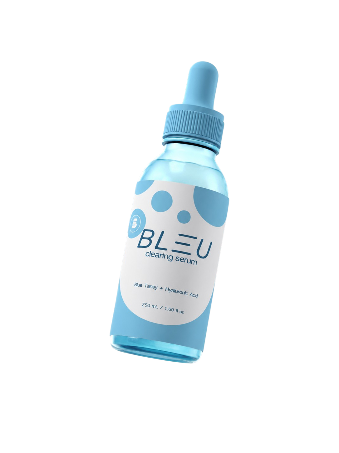
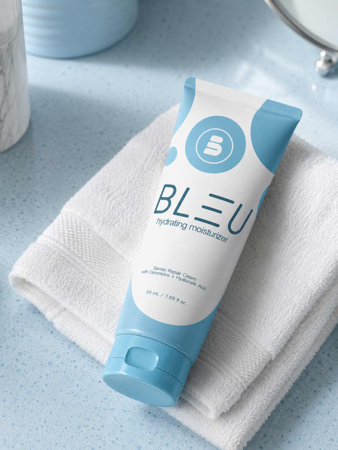
BLEU is a conceptual skincare brand created to explore the intersection of branding, packaging, social media posts, product staging, and digital marketing. Inspired by the purity and calming nature of water, the project focuses on creating a clean, modern identity that communicates hydration, simplicity, and everyday self-care.
The personal objective was to develop a cohesive visual system that extends beyond product packaging into a complete brand experience. From logo design and typography to product photography, advertising, motion graphics, and brand guidelines, every element was designed to reinforce a premium yet approachable aesthetic for all ages.
This project showcases my ability to build a brand from the ground up while considering both creative direction and real-world marketing applications across digital and print platforms.
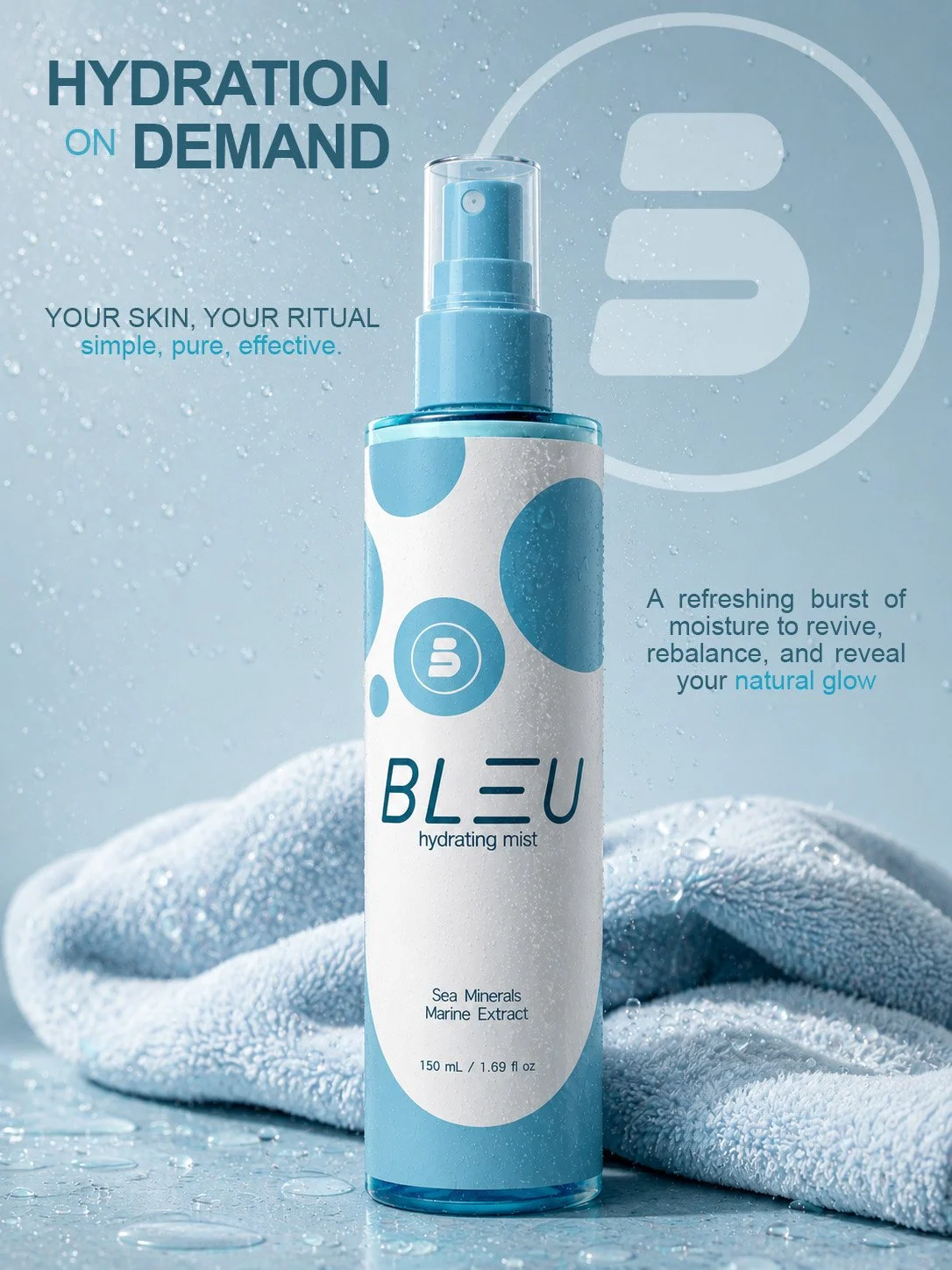
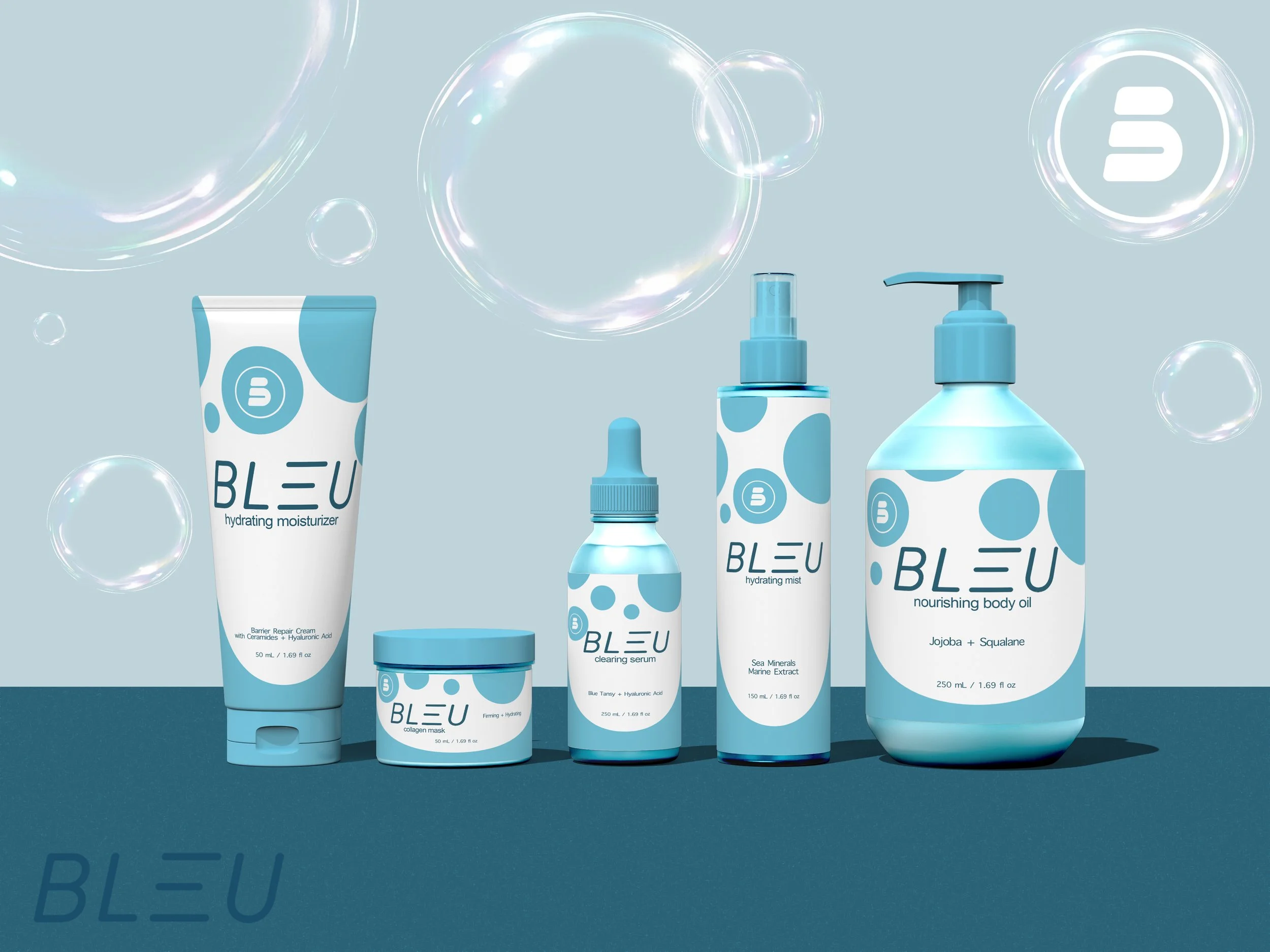
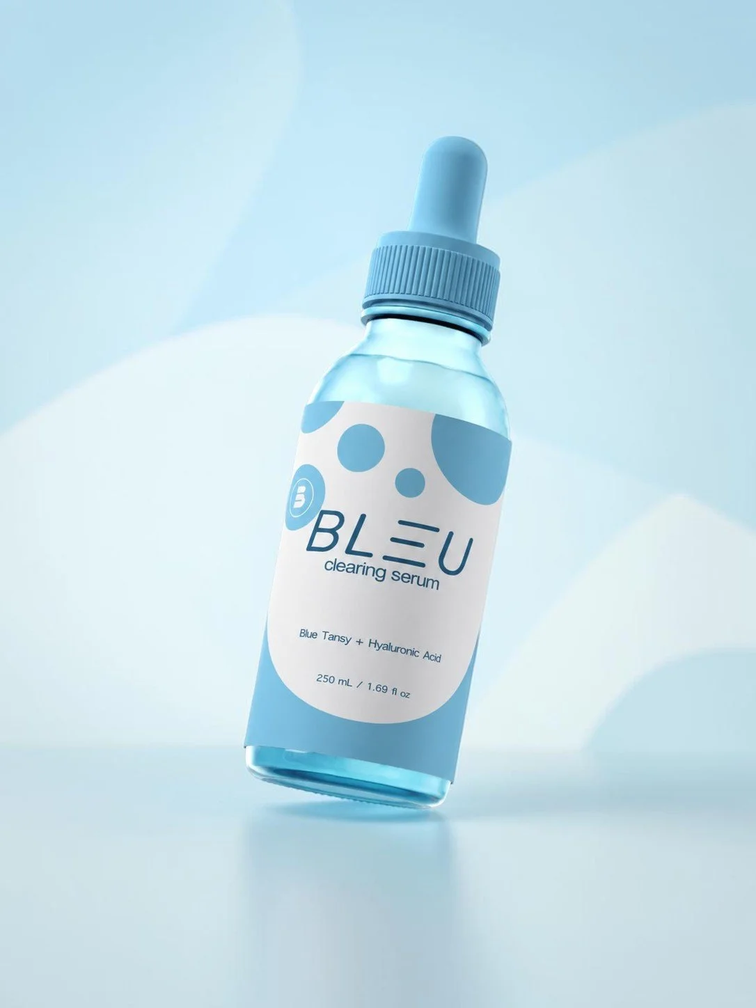
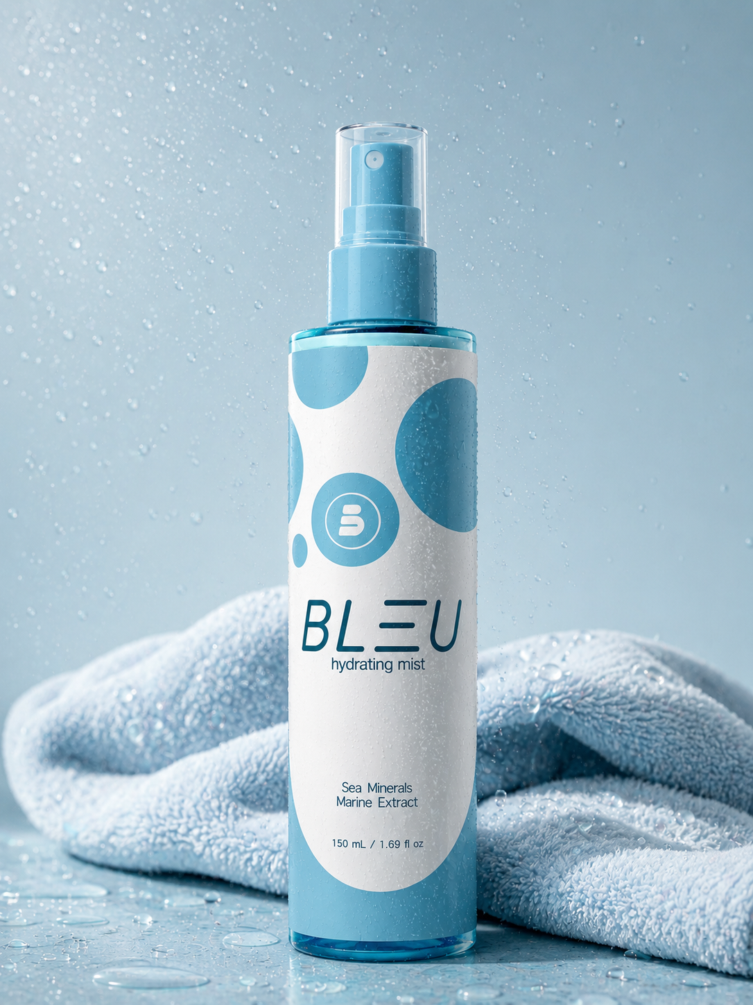
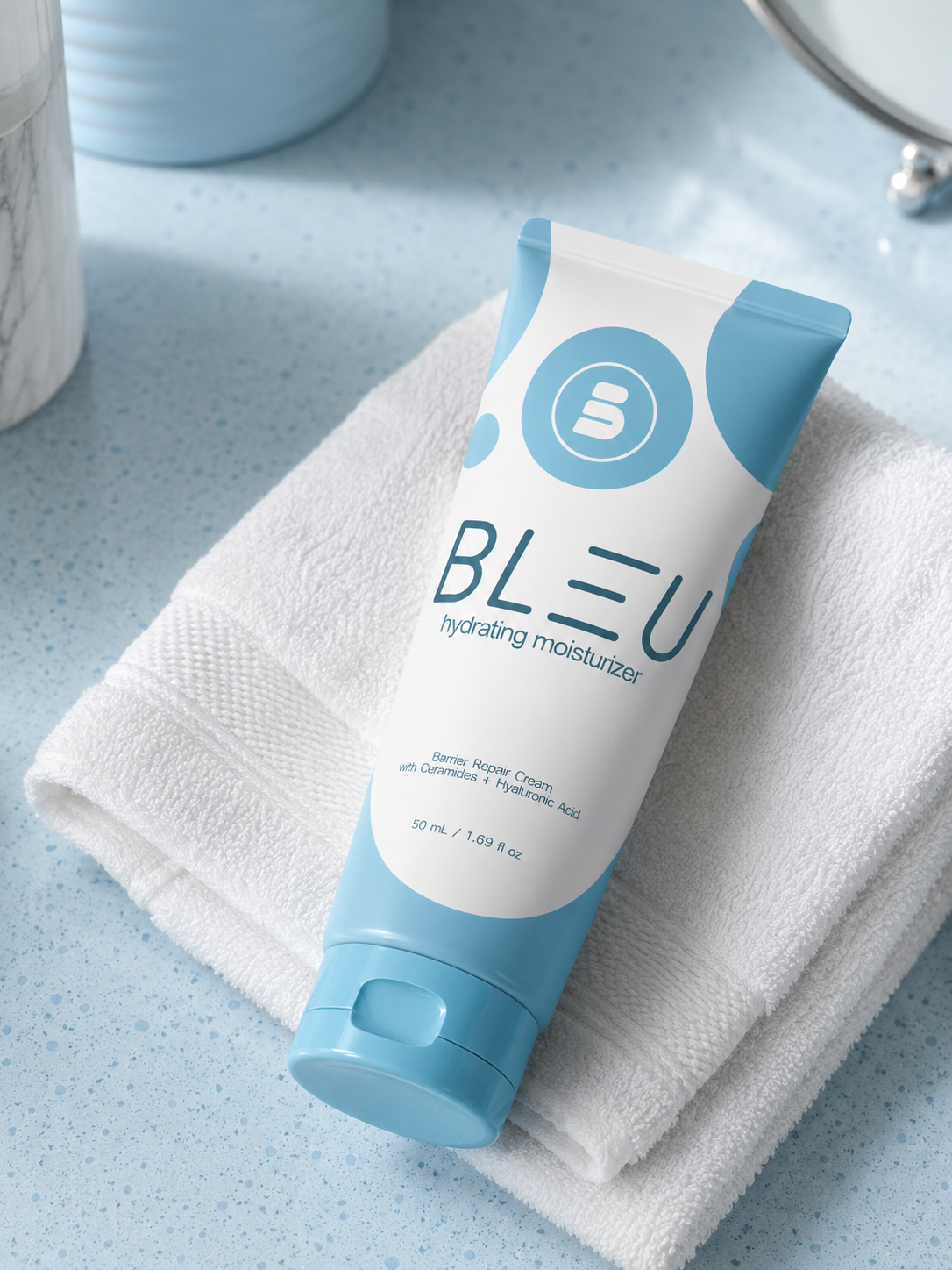
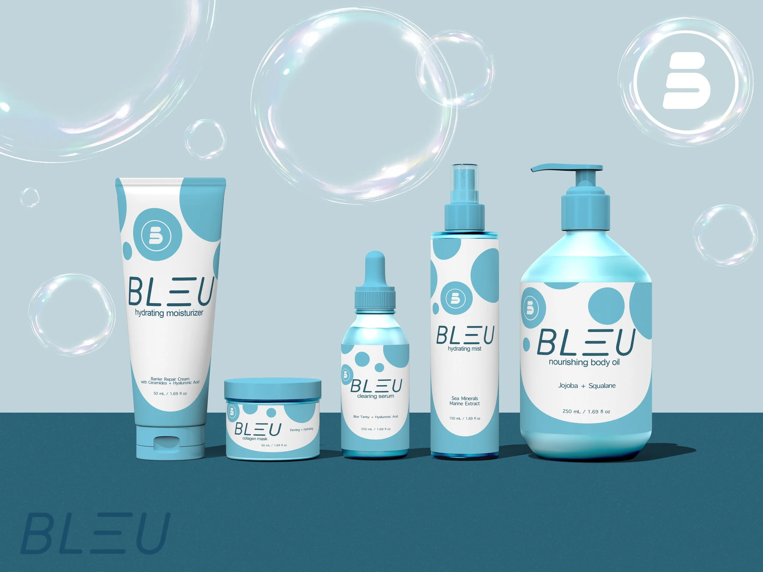
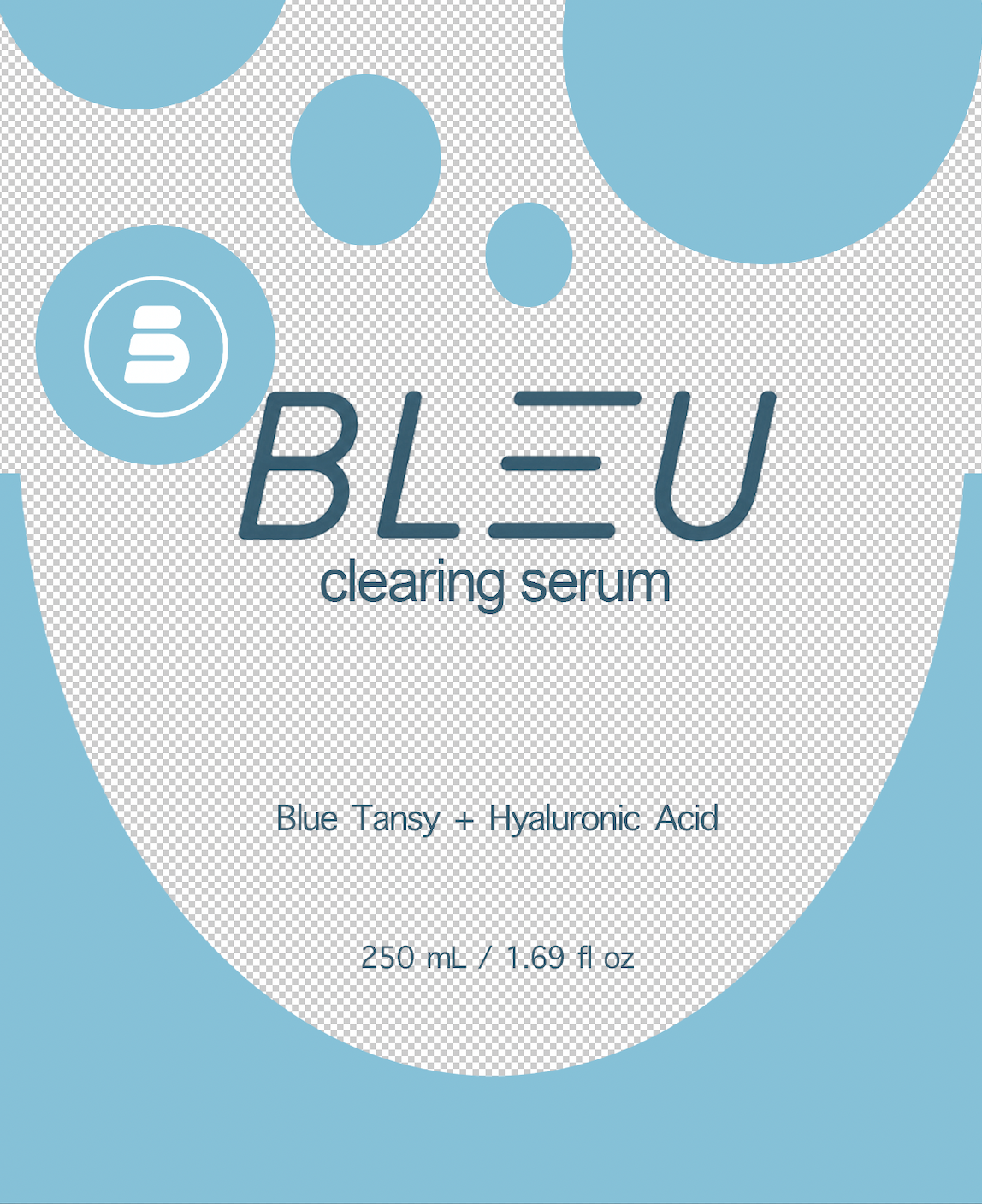
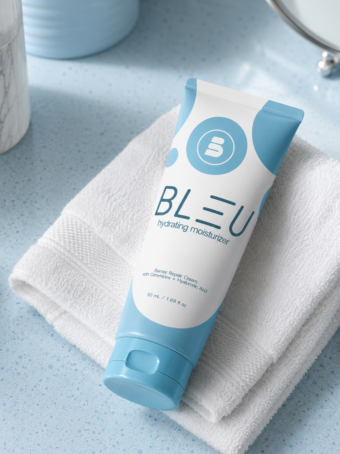
The packaging was designed to communicate hydration through simplicity. Soft blue tones, minimal typography, and water-inspired graphic elements create a clean, modern identity that feels premium while remaining accessible. A consistent visual system allows the entire product collection to feel cohesive across multiple formats and packaging types.


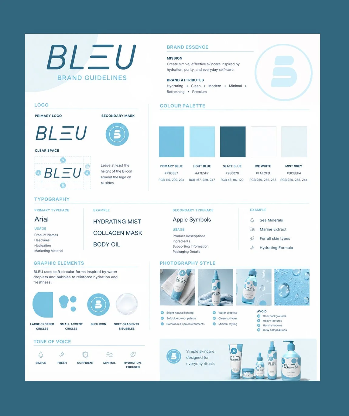
The BLEU Brand Guidelines establish the visual and creative foundation for the brand, ensuring consistency across packaging, digital experiences, advertising, and marketing materials. Every design element—from typography and colour to photography and graphic assets—has been carefully selected to communicate hydration, purity, and modern simplicity.
Inspired by the calming qualities of water, BLEU combines clean layouts, soft blue tones, and minimal graphic forms to create a premium skincare identity that feels approachable, refreshing, and timeless.